


04 Navigation Items
© Z-point - 20???
Navigation
=================
To insert and edit a preset button:
To modify or remove a hyperlink:
To attach an anchor to a section of text:
To insert an anchor to an object:
To view or edit existing anchors:
=================

Navigation bars <TOP>
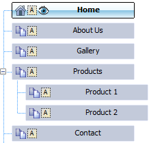
Navigation bars are used to allow the site visitor to jump between pages serving different purposes, e.g. Home page, Gallery, Products, and Contact Us. They are automatically programmed to understand your site structure (see p. 20), making it easy to design a site that's simple to navigate.
Technically, navigation bars facilitate movement between the various sections and levels of a site (see p. 20), providing links to your Home page and other top-

You can easily install navigation bars at any level of your site, reconfigure them to link to a particular part of the site, change the appearance of the navigation bar, and exclude particular pages from navigation as needed.
Inserting navigation bars <TOP>
Navigation bars can be added to any page but are typically added to the master page—as this saves you the trouble of pasting the same element to multiple pages.
When inserting a navigation bar, you can choose how your navigation will appear on your page by choosing:
• Type: The intrinsic design of your navigation bar (e.g., designer, graphical, simple).
• Navigation Type: The site or custom structure on which the navigation bar is based.
• Appearance: The button, separator, and background design of the navigation bar. Either preset or custom designs can be used.
• Pop-
• ID/Anchor: The HTML ID for the navbar object and the object's anchor can be set.
• CSS Properties: Some navigation bars can have CSS styling applied, e.g. a border. See CSS properties in WebPlus Help.
• Actions: An action (change in Z-
To insert a navigation bar: <TOP>
1. Select the page (or master page).
2. From the Quick Build tab (Navigation Items), click  Navigation Bar.
3. Position your cursor and click at the point where you wantyour navigation bar to be placed (the bar will be aligned to the right of this point).
4. From the dialog's Type tab, browse navigation bar categories,clicking to expand if necessary.
5. Review each navigation bar in turn (or scroll through the bars using the keyboard arrows for quick browsing)! Select your chosen navigation type, e.g. Tabs 2.
-
Click the Browse Assets... button to see previews of all navigation bars in the asset browser. Select an item and click OK to return to the dialog.
6. From the Navigation Type tab choose whether to base yournavigation bar directly on the site's Site Structure (enable Based on site structure)—an example site structure taken from the program's Pages tab is shown below.
-
Customize the navigation bar's options (enable Custom).
If choosing Based on site structure, you can:
• Select the level of pages that will be included in the navigation bar: Top Level, Parent Level, Same Level, etc.
• Depending on the main selection, you can opt to include the child pages, anchors, home page, parent page, and/or Hide current page or disabled links.
From the Advanced option, set target frame/window, page ordering, and relative links:
7. Click OK. The navigation bar appears on your page.
Tips:
• Some navigation bars are color schemed, allowing further control of the bar's appearance.
• Use the Task Monitor tab to add navigation-
To edit a navigation bar: <TOP>
1. Double-
2. Change settings available from each tab as described above.
It's also possible to customize navigation bars, buttons, separators, and
backgrounds for your own navigation bar styles. See WebPlus Help.
Inserting pop-
Pop-
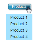
You have full control of what level of your site you want to present in the pop-
To create a pop-
1. Select an object to attach the pop-
2. From the Properties menu, select Pop-
-
Right-
3. From the dialog's Navigation Type tab, check the Show a popup menu of navigation links for this object option to enable navigation from this object.
4. Enable Based on site structure or Custom to either use your site's navigation links as part of the menu or base the pop-

5. From the dialog's Menu Appearance tab, select Text pop-
6. Select a menu option from the box, then edit the values in inputboxes, the choices in drop-
7. Click OK.
Inserting buttons <TOP>
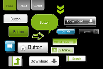
Buttons are an integral part of WebPlus navigation bars (see p. 48) but can also be added onto your web page, either standalone or as part of a form. When clicked by the web visitor, they can be made to display a hyperlink destination, pop-
In WebPlus, buttons can be either a preset design or be created from scratch in the Button Studio. It's quite common to choose a preset and then customize it to fit your requirements (e.g., change the label text or its color).
To insert and edit a preset button: <TOP>
1. From the Quick Build tab (Navigation Items category), click  Button.
2. Position your cursor and click at the point where you want your button to be placed. Alternatively, to set the size of the button, drag out a region and release the mouse button.
3. From the Insert Button dialog, click the button preview box.
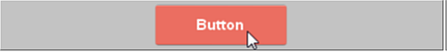
4. From the Asset Browser, select a preset button type and click
OK.
The preview box updates with your chosen button design.
5. Enter a Button Label to identify the button, such as "Home", "Images", "Help", etc. (available only for buttons that allow a text label).
6. From the Hyperlink tab:
• From the Hyperlink Type tab, select a link destination type which will direct the user to a target (e.g., Internet page, site page, file) via a hyperlink (see p. 57).
• From the Target Window tab, select a window or frame type from the Type drop-
7. Click OK.
!!!-
Additional tabs, called Advanced (Hyperlink tab) and Actions, offer
accessibility and search engine relationship (REL) attributes, and a
range of actions (p. 59) that can control user interactivity with your
button. ID/ Anchor and CSS Properties tabs offer advanced
controls and styling options.
For a range of website buttons and other graphical elements stored
in Asset Packs, you can use the Asset Browser. From the Assets tab,
click Browse, then select the Settings category.
-
To edit a button:
• Double-
Creating custom buttons <TOP>
If you're looking to further modify your chosen button preset (or work from scratch) you can use Button Studio, a button design environment integrated into WebPlus. This allows you to focus on your button design without the distractions of other objects on the page, i.e. the design is displayed in isolation.
See WebPlus Help for more information.
To edit a button design:
• Select  Edit Button Design from the context toolbar.
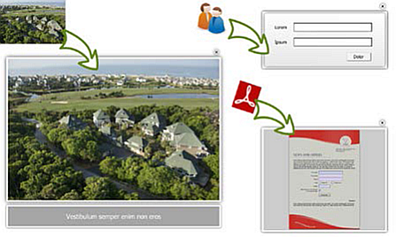
Adding hyperlinks and actions <TOP>
Hyperlinking an object such as a box, some text, or a picture means that a visitor to your website can click on the object to trigger an event. The event is most commonly a jump to one of the following hyperlink targets:
• Site page
• Internet page (somewhere on the web)
• Internet Email
• Anchor (a designated target within a web page)
• File on your local disk or network (for download of files)
• Shopping cart
• Smart object (e.g., a forum, blog or CMS)
• RSS feed (or podcast)
• Navigation element
• User Data
• Picture
Actions are conceptually like hyperlinks, in that something happens on object click or rollover. They differ from hyperlinks in that a click or rollover produces an on-
Adding hyperlinks <TOP>
To add a hyperlink:
1. Use the  Pointer Tool to select the single or grouped object
or highlight the region of text to be hyperlinked.
2. Select  Hyperlink from the Properties toolbar.
3. On the Hyperlink Type tab (Hyperlink tab), click to select the
link destination type, i.e. a Site Page, Internet Page, Smart
Object, etc.

4. Depending on the link type, choose type-
right-
5. Click OK.
To modify or remove a hyperlink: <TOP>
1. Use the Pointer Tool to select the object, or click for an
insertion point inside the linked text. (It's not necessary to drag
over a hyperlinked region of text.)
2. Select Hyperlink from the Properties toolbar.
The object's properties dialog appears with the current link target shown.
• To modify the hyperlink, select a new link destination type, target,
and/or options.
• To remove the hyperlink, click No Hyperlink.
Selecting a target window
The Target Window tab offers a range of target windows, frames, or a
lightbox in which the link destination will be displayed.
To select a target window:
1. From the object's properties dialog's Hyperlink tab, select the
Target Window tab.
2. Select an option from the Type drop-

To view or edit existing hyperlinks:
• From the Tools menu, select Site Manager>Hyperlink Manager to view, rename, or remove hyperlinks.
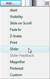
Applying actions <TOP>
Actions can be associated with objects (not text) to allow for greater user interactivity. Available actions, triggered typically by a click or mouse rollover of the object, are as follows:
• Alert: Displays a pop-
• Visibility: Displays a panel (on rollover/click).
• Slide on Scroll: Object slides horizontally from left or right, fading in when scrolled in/out of view.
• Fade-
• Z-
• Print: Prints the current page via a Print dialog (on click). • Slider: Adds an action (Play, Pause, etc.) to a supporting navigation button to control slider playback. You can add an appropriate action to each type of navigation buttons, i.e. a Playaction can be applied to a Play button. (See Sliders on p. 66.)
• Slider Feedback: Changes the button state dynamically according to the slider's current playback state.
• Magnifier: Areas of a picture can be hovered over for an overlaid or offset magnified view. (See p. 39.)
• Pinterest: Adds a clickable pin to your picture (viewable on hover over) that lets you upload your picture to a board on the picture-
• Custom: Runs your own JavaScript code in response to a click,
mouse, key press, and more.
!!!-
You'll need to create a panel in advance before you can assign an action to it, allowing it to display. For more information, see Inserting panels on p. 42.
-
To apply an action:
1. Select  Edit Actions from the Properties toolbar.
2. From the dialog, click Add and choose an option from the flyout.
3. From the dialog, configure the action.
4. Click OK.
On previewing or publishing, a click or hover over of the object will
trigger the action chosen.
Adding an anchor <TOP>
An anchor is a specific location on a page that can serve as the target for a hyperlink (see p. 57). Invisible to the web page visitor, it typically marks a point within some text (such as the start of a particular section) or a picture at some point down the page.
To attach an anchor to a section of text:
1. Either:
i. Use the Pointer Tool to click for an insertion point inside the target text.
ii. From the Text menu, select Insert>Anchor (or press Ctrl+Q).
-
• Right-
The Anchor dialog opens. The anchor automatically adopts the name of the adjacent word in the target text.
2. (Optional) Rename the anchor using the Name of the anchor input box.
3. (Optional) Check Include Anchor in Navigation to allow the anchor to be accessed via a navigation bar instead of a hyperlink. You'll need to ensure Include anchors is checked on your navigation bar settings and that the anchor is given a title.
4. Click OK.
To insert an anchor to an object:
1. Use the Pointer Tool to select the target object.
2. Select  ID and Anchor from the Properties toolbar.3. In the dialog, select Treat this object as an anchor.
4. (Optional) To assign a specific anchor identification name to
your anchor (rather than using the object's HTML ID),
uncheck Use object ID and then type a name into the Anchor
ID input box.
5. (Optional) Check Include Anchor in Navigation.
6. Click OK.
To view or edit existing anchors:
• From the Tools menu, select Site Manager>Anchor Manager
to view, rename, or remove an anchor attached to a particular
object. You can also include the anchor in page navigation.
Using lightboxes <TOP>
Lightboxes are a fun and modern way of displaying all kinds of web content superimposed over your web page. When you click an object, the light box presents your chosen content "on demand" in a pop-
To create a lightbox for a picture on your web page:
1. Select the picture (preferably a thumbnail).
2. Click Hyperlink from the Properties toolbar.
3. From the Hyperlink Type tab, select Picture from the menu.
4. From the Target Window tab, choose Lightbox from the Type drop-
5. (Optional) Add a caption to the picture in the lightbox using the Caption box. You can also make the picture part of a slideshow using the Slideshow Name drop-
6. Click OK.
To restrict the display size of this linked "lightboxed" picture, WebPlus scales down pictures to a maximum width and height (default 800 x 600pixels). The maximum width and height can be modified. (See Setting site properties on p. 22).
To create a lightbox to a local picture:
• As above but choose the File option instead of Picture.